Displaying safety signs in the workplace is required for all business owners, but understanding signage rules isn’t easy. That’s especially true for comprehending the differences between mandatory and prohibition signs.
In this guide, we’ll cover the main differences between mandatory vs prohibition signs, including when to use each, important display tips, and exact specifications outlined in the Australian Standard 1319-1994.
Quick Guide to Australian Standard 1319-1994
There are many types of safety signs, and they’re all important for preventing injuries and ensuring a safe environment for staff as well as visitors. The Australian Standard 1319-1994 is an official document that outlines all the requirements for properly displaying these workplace safety signs.
This document not only explains the importance of each type of safety sign, but also covers design specifications, important emergency information, and display requirements. In other words, the AS 1319-1994 is the Holy Grail of workplace safety signage, and every business owner should abide by it.
What Is a Mandatory Sign?
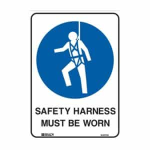
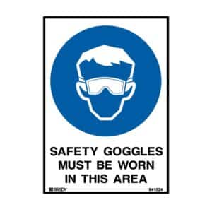
Put as simply as possible, a mandatory sign is a sign that shows what MUST be done in the workplace. These signs indicate that an action must be carried out, such as wearing safety goggles or other protective gear in certain areas of the workplace.
In the text, these signs almost always incorporate the word “MUST” within the overall message, letting people know about an action that must be carried out with no exceptions.
Mandatory Sign Design Guidelines
The required symbolic shape for all mandatory signs is a blue circle containing a white pictograph. The background should always be white, and any text within the sign must be displayed in bold black lettering for easy visibility.
What Is a Prohibition Sign?
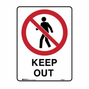
While a mandatory sign is all about what must be done, a prohibition sign indicates actions that SHOULD NOT be done within the workplace. Prohibition signs basically inform workers and visitors about actions and activities that are not permitted and should not be carried out.
Prohibition Sign Design Guidelines
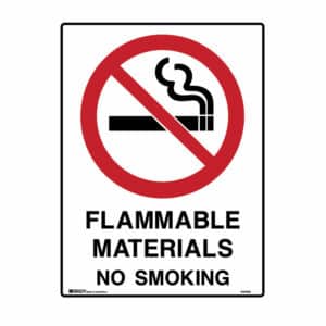
Mandatory signs use a blue and white colour model, while prohibition signs require a red and white design. These signs use a red circle containing a diagonal slash through it, and the prohibited activity is depicted by a black pictograph.
For prohibition signs, the background should always be white and text is required to be displayed in bold black lettering. The perfect example is smoking; when smoking is prohibited in the workplace, the prohibition sign is likely to contain a red circle with a cigarette in the middle and a diagonal slash through the image.
Want more information regarding workplace sign requirements? Get in touch today for all the details on mandatory signs, prohibition signs, and more.
Categorised: Caution Signs, 2024


